Wednesday, 19 March 2014

Research & Planning: Annotated Examples Contents


This contents page is also from Q music magazine, and has the same target audience as the music magazine front cover. The contents page also sticks to codes and conventions, the main image is the indie band ‘The Courteeners’, four out of 3 of the men are giving a direct address. They are also stood on a hill making them higher, giving them importance.


The page uses columns, making it easier for their readers to navigate around. Q have also given the article titles pages highlighted in red, to link with the red background in Q’s main heading. They have seperated the features and the arcticles that are used in the magazine every month, once again making it easier for the audience as they may have seen something that has sparked their interest on the cover, making it easy for them to locate. Against the image there is also a pull quote with the number of the article incouraging the audience to read it. Further more the magazine contents includes the issue number, date, website and a page number which I will also incorparate into my own work.

Research & Planning: Annotated Example Front Cover


I have taken this front cover from music magazine ‘Q’, I have also made arrows pointing towards the key features in the magazine. This magazine cover is starring Lily Allen as its main cover image, at the time of the magazine release date Allen had just released a new album called ‘It’s not me, its you.’

The main cover line of the magazine is ‘sexy beast, Lily Allen, & her wicked, wicked ways.’ Q have used mise-en-scene to set the scene, using two black panthers to link with the cover line ‘sexy beast’. Lily has her back to the audience and is looking over her shoulder, she is also topless making the pose seem provocative and making it seem as if she wants the audience to follow her. She also has her hand on her hip to assert her dominance, making her have a bigger visual presence, the hands on hip pose is also associated with being ready for action, e.g. boxers can be seen doing it before a fight.  

The colour scheme of the magazine consists of 5 colours red, black, white, blue and grey. Red is the colour of Q’s logo, it also highlights key words amongst the cover lines such as, ‘wicked, wicked’ as red is an associated with danger, ‘exclusive’ is also highlighted in red as it is a connotation for warnings and is used to alert the reader. They also vary the fonts through out the magazine highlighting key words in bold also.


Q has a target audience of rock and roll fans, which are 68.3% male and 31.7% female. It has an older target audience which is evident in its price of £3.99, as that may be too expensive for people of a younger age group. It is also aimed at the working class which is also evident from topics covered and images. I think this magazine cover is successful and follows the codes and conventions of a music magazine, it is also successful providing for Q’s target audience.  


Research & Planning: Whats on the Market?

Whats on the market?


The first music magazine I have chosen to study is a copy of NME, NME is an alternative rock music magazine with a high profile. The first thing my eyes are drawn to is the image of artist, Florence Welch. She is placed against plain background, which looks as if it may be a wall but the background doesn’t distract the audience away from the image. She is also using a a direct address which makes it look as if she is looking toward the audience locking their full attentions, it also gives a more personal approach as the audience may have felt a connection between themseleves and Florence in this image. Her pose could be seen as provocative as it looks as if she is about to unbutton the sleeve of her shirt.

The element I noticed is the text, ‘NME’ is written in a clear bold font on the top left of the magazine, making it clear it is the title, the converlines all use the same text which creates the same theme through out the front cover, the font looks the same as a font I can access called ‘fututra’. Also, all of the front cover is written in capitals apart from the web address, this works well to make the magazine important and stand out. The colour of the text is also similar using 3 key colours black, white and red which are usually associated with the ‘rock’ genre.

A celebrity endoresment on the main cover also makes the magazine successful as her fans will buy the magazine as she is simply on the cover, also she is current for the time period and people may idiolise her or be interested to read about her, which will encourage them to purchase the magazine.

The magazine also keeps to a rule of thirds and there is typcially more on the left third of a magazine as the left third of a magazine is the side exposed in a shop. The spacing between the text is also fairly equal and makes sure it also exposes the key features of the artist, Florence.


NME portrays its readers by this cover in quite a classy way but still encludes that element of ‘’rock and roll’ by using the top right hand image of the Joy Devison artist, Ian Curtis as smoking and he’s looking away from the camera. Giving the impression that he’s living for the moment and isnt really too interested in whats going on he just lives for his music, which will portray the values of some of the readers who purchase NME.


The next magazine I have decided to study is music magazine ‘SPIN’, the magazine features upcoming artist Azelia Banks, Azelia is placed against a pink wall, with a floral curtain on the left which juxtaposes her brightly coloured skimpy outfit which gives the ‘ good girl, gone bad’ look, Azelia is also in a playful and flirty pose showing some cleavage.
           
There isn’t a lot of text on main conver page to keep the audience drawn on Azelia, it is a simple cover and easy to navigate. The text is all also in capitals,  apart from the right hand corner text which has the names of artists inscribed. Like before the text is written in capitals to draw the readers attention.

The magazine also uses a rule of thirds to make it even, the magazine is very plain making it easy to navigate to its audience. This shows ‘SPIN’ is aimed at a younger target audience as its not filled with text and is mainly an image.


The next music magazine I have chosen is Q magazine, Q is aimed at a slightly older target audience then I have planned to aim my magazine however, I thought it would be beneficial to study. They have chosen to use a current celebrity to endorse the magazine, Adele is using a direct address creating a connection between her and the audience, the cover line ‘Adele blows us away” is a play on words as it links to the image of her hair which is being blown backwards. She also has her hand up towards her lip, which creates a ‘thinking’ pose.

The text of the magazine is once again in capitals making the magazine look important, there is only 3 different fonts used through out the cover, it also sticks to the colour scheme of red, white and black with gold for the information in numbers, possibly to make them look more exciting.

The magazine also keeps a rule of composition and a rule of thirds to prevent the image from looking too cluttered or blocking the image, the magazine looks fairly glamorous as a whole.   

Research & Planning: Questionnaire Results

Question 1: Do you read music magazines?


Question 2: If you answered no why?

Responses to question 2:

'Not interested in reading magazines'
'Not interested in reading about music'
'Haven't found music magazine that interests me'

Question 3: What attracts you to a music magazine?


Question 4: What genre do you read?


Question 5: Which music magazine do you usually purchase?


Question 6: How much do you pay for your music magazine?

Question 7: How often do you buy music magazines?

Question 8: What gender are you? 

I asked an equal amount of male and females, I asked 10 from each gender to answer my questionnaire to collect an equal amount of data.


Question 9: Do you think there is a gap in the market for an indie music magazine?

From the 20 people I asked 12 people agreed there was a gap in the market for a music magazine, and when prompted couldn't even think of a current indie music magazine. However, 8 people people circled that they didn't think there was a gap in the market for a new indie music magazine. 

Question 10: Would you be interested in buying a new upcoming indie music magazine?


Question 11: What would you like to see in the magazine?

  • Festivals
  • Gigs
  • New artists 
  • Charts
  • Gossip
  • Interviews

Question 12: How old are you?

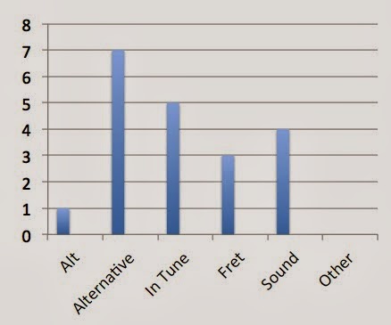
Question 14: What do you think is an appropriate name for an upcoming music magazine?


In order to gain equal data I asked the same amount of people, from each age group to fill in my questionnaire. 


Question 13: Do you only access the music magazines in print version?


From the 17 people in my questionnare that stated they read music magazines, 12 people claimed that they would also look at music magazines in print version, as its a faster way to access the information they were seeking from the magazine. This didn't suprise me as I personally access some music magazines online as its easier and cheaper.


Question 14: What do you think is an appropriate name for an upcoming indie music magazine?


Question 15: How much do you think is an appropriate name for an upcoming indie music magazine?

The average price people stated they would pay for the magazine was £3, I thought this was an acceptable price for my music magazine and have decided to give the magazine this price.